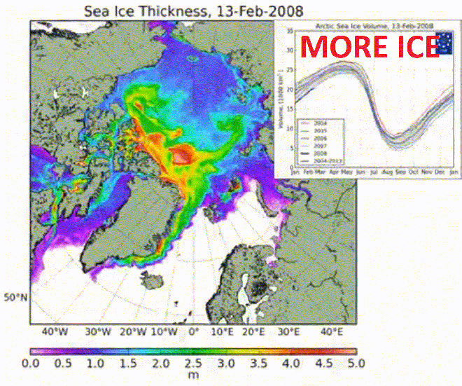
Thick ice covers much more of the Arctic than ten years ago. Volume is the highest in three years, and is in the normal range.
Short one this one, needs no comentary:

Thick ice covers much more of the Arctic than ten years ago. Volume is the highest in three years, and is in the normal range.
Short one this one, needs no comentary:
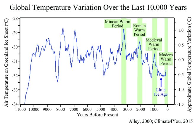 This graph’s title states that it is showing “global temperature variation” yet it is only showing Greenland glacier summit temperature which is a high altitude local proxy and not reconstructed global temperature.
The original graph, shown below, is from Climate4You which clearly shows that no reference to it being for global temperatures except for the right hand side label.
As an aside this graph is thoroughly debunked also by Skeptical Science in this glorious post.
The original caption to this image also makes it clear it is not referring to global temperatures and also states that the data finishes in 1854.
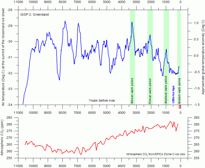
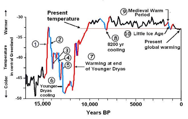
The upper panel shows the air temperature at the summit of the Greenland Ice Sheet, reconstructed by Alley (2000) from GISP2 ice core data. The time scale shows years before modern time. The rapid temperature rise to the left indicate the final part of the even more pronounced temperature increase following the last ice age. The temperature scale at the right hand side of the upper panel suggests a very approximate comparison with the global average temperature (see comment below). The GISP2 record ends around 1854, and the two graphs therefore ends here. There has since been an temperature increase to about the same level as during the Medieval Warm Period and to about 395 ppm for CO2. The small reddish bar in the lower right indicate the extension of the longest global temperature record (since 1850), based on meteorological observations (HadCRUT3). The lower panel shows the past atmospheric CO2 content, as found from the EPICA Dome C Ice Core in the Antarctic (Monnin et al. 2004). The Dome C atmospheric CO2 record ends in the year 1777.
Further to the caption
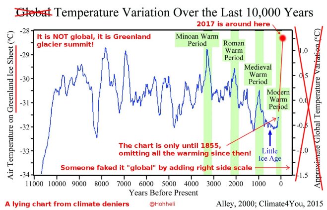
It is quite obvious that the graph of note was modified from the original by
all for the purpose of even more misleading of the public than the original graph.
Here is an annotated version of this graph covering what’s mentioned above by @Hohheli.
It’s also worth pointing out that at the location of where this ice core was sampled in Greenland that the local temperature has increased by over 3°C since 1854.
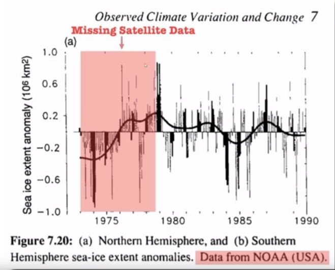
This is from the 1990 IPCC report which shows that there is satellite data from before 1979 which apparently is now missing, presumed deleted due to being inconvenient. Deniers claim that the NSIDC dataset started at a peak in 1979 which amplifies the current sea ice losses.
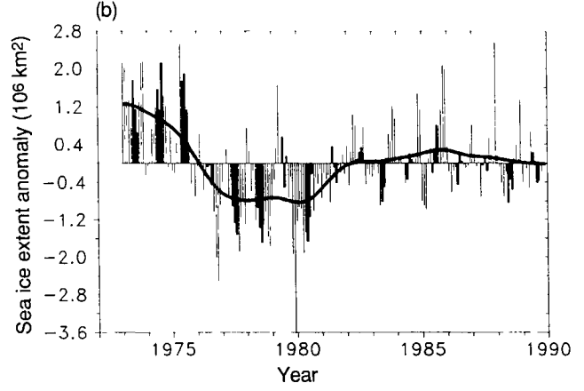
Before we discuss this missing data it’s probably worthwhile looking at image (b) that was cropped from the above:
This is the sea ice anomaly for Antarctica showing quite convenient data prior to 1979, perhaps not showing inconvenient data is happening to other parties?
Anyway, back to the missing data…
The data from these graphs is available here: https://nsidc.org/data/g00917 which has been incorporated along with the modern and more superior dataset in red in this video by Kevin Pluck:
As you can clearly see the 1979 peak is now insignificant to the current losses basically neutering any argument about starting points and deleted data from deniers.
But why stop here?
In fact data as far back as 1964 (bearing in mind Sputnik was only launched 7 years earlier) is far from missing and is available here: http://nsidc.org/data/nimbus/data-sets.html
“There were no fancy satellite sensors in 1964,” he said. “Scientists strapped a video camera to the Nimbus 1 satellite, sent it into orbit, and hoped for the best.” As it circled the globe in August and September, Nimbus 1 transmitted still shots of the Earth to a television monitor, which researchers photographed.
After using the stills for weather forecasting research, scientists archived them in a secure storage facility. In 2009, Gallaher stumbled on a NASA conference poster about the recovery of the film, and realized that it would have captured images of the Arctic sea ice minimum and the Antarctic maximum in 1964. Satellite records of Arctic sea ice extent only went as far back as 1978. There were other observations before 1978, like ice charts from naval ships, radiometer records, and other satellite imagery. None of these gave scientists a full view of the Northern Hemisphere. But the old film would. So Gallaher teamed with Meier and the Lunar Orbiter Image Recovery Project (LOIRP) at NASA Ames Research Park to try to recover any information the old films might contain.
With those images, Campbell produced the first satellite maps of the sea ice edge in 1964 and an estimate of September sea ice extent for both the Arctic and the Antarctic. According to the data, September Antarctic sea ice extent measured about 19.7 million square kilometers. “That’s higher than any year observed from 1972 to 2012,” Meier said. Figuring out the sea ice extent for the Arctic was more challenging. It was harder for the team to distinguish the ice edge along the coasts from snow or glacier-covered islands in the Canadian Archipelago. Also, there were not many images of Alaska and eastern Siberia to work from, so Campbell relied on old Russian and Alaskan ice charts. His analysis yielded a September 1964 Arctic sea ice extent of 6.90 million square kilometers. “The 1964 estimate is reasonably consistent with 1979 to 2000 conditions,” Meier said. “It suggests that September extent in the Arctic may have been generally stable through the 1960s and the early 1970s.”
To give an indication of the above challenge, here is a sample from the Nimbus-1 satellite from September 1964:
As you can see the scanning distorts with latitude with large areas of data not available along with much cloud cover obscuring the sea ice.
Here is a sample from a later Nimbus-2 satellite in 1966: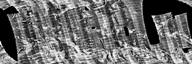
Data from 1850 – here: http://nsidc.org/data/G10010
The short response to this is that the ice core was taken from high altitude in Greenland and also the data ends in ~1850 not showing any “present global warming” at all.
Please also refer to my other post relating to another graph based on GISP2 Greenland ice cores.
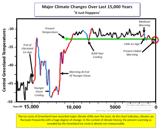
The indicated source of this graph is unmaintained and the image is now not available but is on the WayBack Machine showing the following version along with a disclaimer:
Global Research Editor’s note
The following article represents an alternative view and analysis of global climate change, which challenges the dominant Global Warming Consensus.
Global Research does not necessarily endorse the proposition of “Global Cooling”, nor does it accept at face value the Consensus on Global Warming. Our purpose is to encourage a more balanced debate on the topic of global climate change.
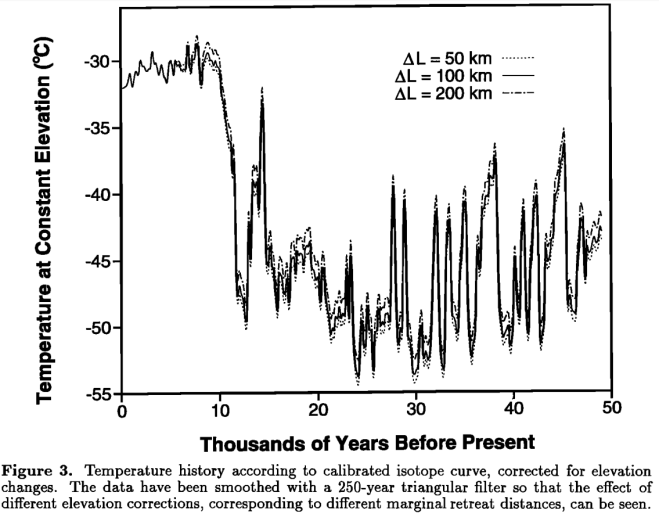
As far as I can ascertain this is the original source of the graph. As you can see the graph has been flipped horizontally and cropped to the first 17,000 years.
This confirms that the data come from GISP2 which means that the use of “present” in the Cuffey and Clow paper follows a common paleoclimate convention and is actually 1950. The first data point in the file is at 95 years BP. This would make 95 years BP 1855 long before any other global temperature record shows any modern warming.*
This is an absolute favourite graph as it clearly shows definitive proof that CO₂ has no impact on temperature. Quite obviously, right?
This graph shows half a billion years of geological time. (In fact the original graph includes 4.6 billion years but it has been cropped it to a mere half a billion I guess after it was pointed out that it was the actual age of the Sun).
The source of this graph is The Biology Cabinet.

Biology Cabinet is an institution based in San Nicolas de los Garza, Nuevo Leon, Mexico. Our objective is to publish updated information on Biology and scientific topics of interest related with other disciplines, as well as describing the methodology of science in a clear way.
Nasif Nahle is the site owner and author of the self published paper which contains this graph among others of a similar nature.
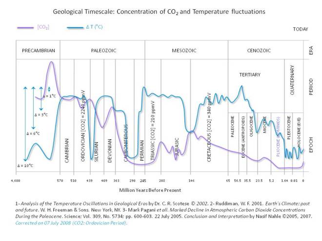
In the original image note there is no y-axis scale for CO₂ and the blue arrows indicate a sort of temperature scale with the arrow lengths as follows: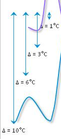
The time divisions on the x-axis, which are based on geological periods, have arbitrary widths unrelated to the shown duration. I’ve annotated the durations in red and you can see that the grid spacings are totally unrelated to the time periods shown:
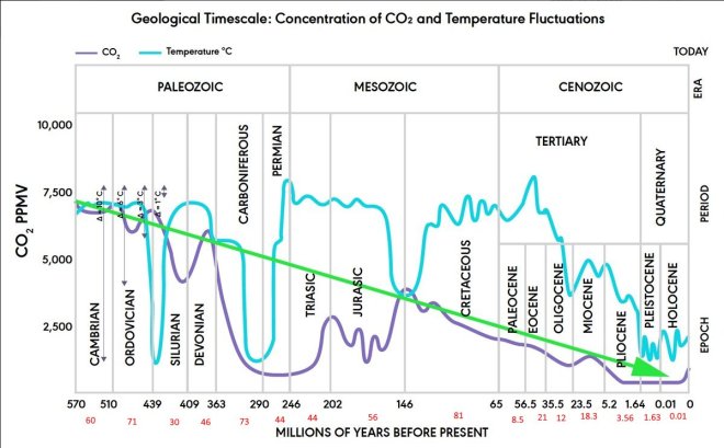
Based on the arbitrary x and y-axis divisions we can safely conclude this graph was hand drawn by the author as no known graphing utility would be able to render this graph in such a manner.
It is also worth noting that the paleo CO₂ model has huge uncertainties e.g.: during the Ordovician CO₂ was between 2,400 and 9,000 ppmv making the graphed value of ~7,400 ppmv meaningless without error bars. The time step is also 10,000,000 years meaning the 1,000,000 year glaciation in the late Ordovician impossible to correlate with the CO₂ model. (Making the hand drawn temperature dip on the graph ~10 times too wide).
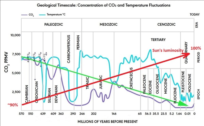
Seeing as drawing lines on a graph seems to be a thing here’s my contribution:
Here I hope to catalogue them as a quick place to look up and help provide simple and clear answers to debunk claims against the harrowing possibility of catastrophic climate change.
I’ll title each post with the title of the graph as it appears in the image which should make finding them easier.
