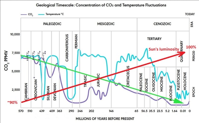
This is an absolute favourite graph as it clearly shows definitive proof that CO₂ has no impact on temperature. Quite obviously, right?
This graph shows half a billion years of geological time. (In fact the original graph includes 4.6 billion years but it has been cropped it to a mere half a billion I guess after it was pointed out that it was the actual age of the Sun).
The source of this graph is The Biology Cabinet.

Biology Cabinet is an institution based in San Nicolas de los Garza, Nuevo Leon, Mexico. Our objective is to publish updated information on Biology and scientific topics of interest related with other disciplines, as well as describing the methodology of science in a clear way.
Nasif Nahle is the site owner and author of the self published paper which contains this graph among others of a similar nature.
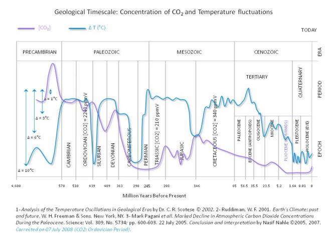
In the original image note there is no y-axis scale for CO₂ and the blue arrows indicate a sort of temperature scale with the arrow lengths as follows: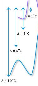
- 1°C = 15 pixels
- 3°C = 71 pixels
- Not 45 as expected by 3 × 15 pixels
- 6°C = 127 pixels
- Not 90 as expected by 6 × 15 pixels
- 10°C = 224 pixels
- Not 150 as expected by 10 × 15 pixels
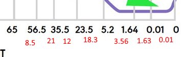
The time divisions on the x-axis, which are based on geological periods, have arbitrary widths unrelated to the shown duration. I’ve annotated the durations in red and you can see that the grid spacings are totally unrelated to the time periods shown:
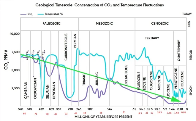
Based on the arbitrary x and y-axis divisions we can safely conclude this graph was hand drawn by the author as no known graphing utility would be able to render this graph in such a manner.
It is also worth noting that the paleo CO₂ model has huge uncertainties e.g.: during the Ordovician CO₂ was between 2,400 and 9,000 ppmv making the graphed value of ~7,400 ppmv meaningless without error bars. The time step is also 10,000,000 years meaning the 1,000,000 year glaciation in the late Ordovician impossible to correlate with the CO₂ model. (Making the hand drawn temperature dip on the graph ~10 times too wide).
Seeing as drawing lines on a graph seems to be a thing here’s my contribution: